


Reports and Dashboards Every Team Enjoys Using
If there’s one tried-and-tested recipe for turning customer insights into action, it’s when every team can come together to work on an issue.
But your ability to collaborate is only as good as the platform you’re working on. And let’s face it – finding your way around analytics platforms isn’t straightforward for most.
A steep learning curve can confuse first-time users, making jumping in and finding insights difficult. Plus, without a clear view of what the rest of your team is working on, it’s challenging to keep everyone up-to-date on the latest intel.
It doesn’t have to be this way. Our new, user-friendly Reports and Dashboards are here to help.
They’re simple, intuitive and make collaboration easier than ever.
One place for analyzing customer feedback
When you want to drill down into your data, it helps to have your analytics arsenal close to hand.
That’s why we’ve combined two sections, previously known as Analytics and Insights, into Reports – one place for a seamless experience where nothing gets lost.
This new tab lets you rapidly generate any report, including Impact Analysis. Select ‘Create new report from scratch,’ then head to the ‘Type’ button at the top of your window. Select ‘Impact Analysis’ from the drop-down menu, and you’re all set – now you can tap into the key drivers of your net sentiment and NPS scores.
An intuitive interface for every team
Sophisticated charts and dashboards might be impressive, but they’re no fun if they’re confusing. The most advanced analytics platforms are often the most difficult ones to use.
At Chattermill, we prefer it when advanced customer feedback platforms can be easily navigated. That way, everyone can contribute to making better, data-driven decisions.
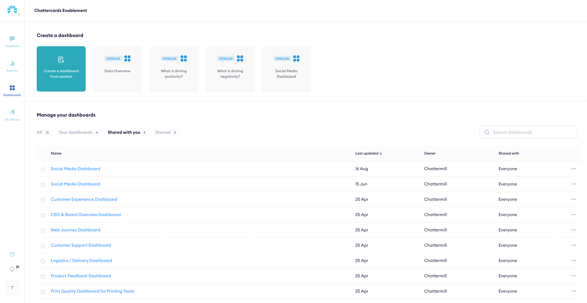
We’ve designed our new reports and dashboards menus with this in mind. You can now find insights in just a few clicks, with ready-made templates available at the top of the screen. Just hover over the template you’d like to create, and select ‘Use this template’ to instantly generate one of our reports or dashboard presets.
And with our new file navigator, you can better manage all the reports and dashboards available. Choose between viewing the reports you’ve created and the ones your team has shared with you, thanks to the ‘Your reports’ and ‘Shared with you’ tabs. Favorite either of these for fast access, and see them immediately in the ‘Starred’ tab.
A shared workspace for cross-team collaboration.
Work in isolation isn’t exactly useful for collaboration. To collaborate properly, your team needs to be kept up-to-date on the latest findings, so they can better understand the insights they’ve found.
Our new reports and dashboards layouts are here to give a helping hand. Now, thanks to a handy' Shared with you' tab, you can see a birds-eye view of everything your team has been working on.
We’ve also made it much more straightforward to organize all of the work you’ve created.Got a shared report that you need to keep tabs on? Favorite it for fast access, and stay on top of the metrics that are important to you.
Ready-made templates, whatever team you work in
Not everyone’s a natural when it comes to reports and dashboards.
It’s easy to become overwhelmed with what’s possible: from generating insightful reports into your NPS to drilling down into the key drivers of your net sentiment score, Chattermill can help you do a lot with your data.
To help make things easier, we’re introducing a range of ready-made templates designed to kick-start new users into finding insights.
With five reports and three dashboard templates, you can now instantly generate reports that get you up to speed on your data without starting from scratch.
Report Templates
How do customers feel about your business?
Pick this template if you need a general dive into which business areas your customers are having the best and worst experiences with. Instantly generate a chart of where positive and negative sentiment has been directed over the last 12 months, divided by category: e.g. product attributes, logistics, or online experience.

What has the biggest impact on customer sentiment?
Looking to prioritize your work? This template generates an Impact Analysis chart of what’s impacting your net sentiment score, showing which themes affect your customer sentiment the most. At a glance, you can instantly see which areas need your attention and focus your team’s work where it matters most.

What drives the most negative/positive sentiment?
These two templates are designed to show you which business areas cause your customers the most happiness or unhappiness. Each generates a chart that shows which category has had the most negative effect on your impact score, with a comparison from the previous 12 months.

How do customers feel across different channels?
If you want to see how sentiment compares across your different sources, this template will be your go-to. Select it to generate a report highlighting how your net sentiment score has changed over the last 12 months, with each data source – e.g., Review, or Social – highlighted in a separate line on the graph.

Dashboard Templates
Data Overview
Sometimes, you need to take a step back from your feedback data. We’ve created this template for precisely that – an overview of all the feedback available.
Included are charts showing the total amount of feedback processed, how your customers feel across channels and categories, and a breakdown of the phrases customers use most often. If you’re a little stuck with how to use the dashboard, we’ve included a handy annotation at the top to direct you.

What’s driving positivity/negativity?
Select this template to dig deeper into the root causes of your negative or positive feedback.
See how customer sentiment has changed over the last 12 months, which themes have the most impact on your net sentiment, which categories drive positive or negative sentiment, and the key phrases associated with the relevant sentiment. You can also customize the titles and filters within each chart to make them your own and share them with your team.

Empower your team to work smarter
The great news is that today, our new Reports and Dashboards layouts are available to all Chattermill users. Invite your team members so everyone can start finding insights and collaborate more efficiently than ever.
Want to see how Chattermill can help you find insights with Impact Analysis? Schedule your demo today!
Already a Chattermill customer? Read our FAQ or get in touch with your CSM to learn how you can get the most out of Reports and Dashboards, or head to the Reports or Dashboards section in Chattermill to give it a try right away.


.jpg)